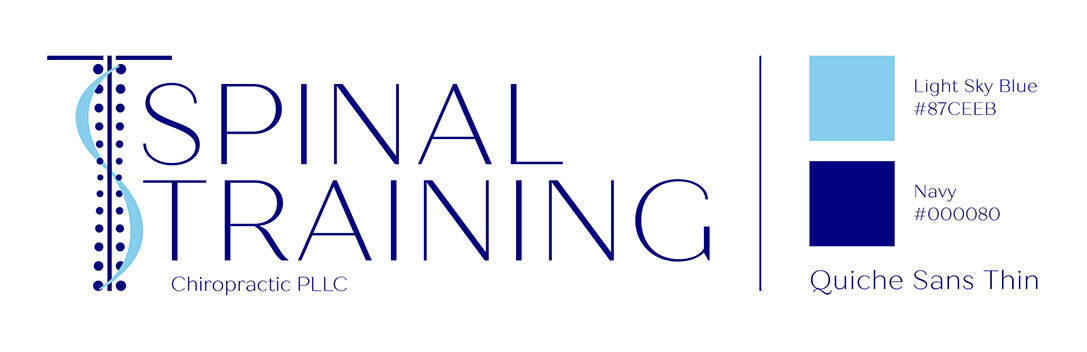
Spinal Training Chiropractic PLLC Logo
Logo for Spinal Training Chiropractic PLLC, a new chiropractic office in Orem, Utah, providing therapy to improve posture, decrease pain, and deliver lasting results.
Competitors were researched to ensure the new logo would be unique while still conveying the focus and mission of the organization. Several ideas were sketched and presented to the client. After the initial concept was selected, refinements were made and typography and colors were picked. All color choice options presented for this logo were carefully picked to be colorblind-friendly.
The final logo includes a stylized spine icon that reinforces the chiropractic focus and a flowing wave that introduces a sense of movement and wellness, subtly suggesting alignment and balance. These elements form the initial letters of the company name. Quiche Sans Thin was used for the text and was chosen to match the feel and look of the logomark. Navy and Light Sky Blue were chosen to convey trust, stability, and professionalism. Visit the Spinal Training Chiropractic PLLC Facebook page.